CLIENT
DOWN TO EARTH FESTIVAL
SERVICE
Branding / POSTER DESIGN
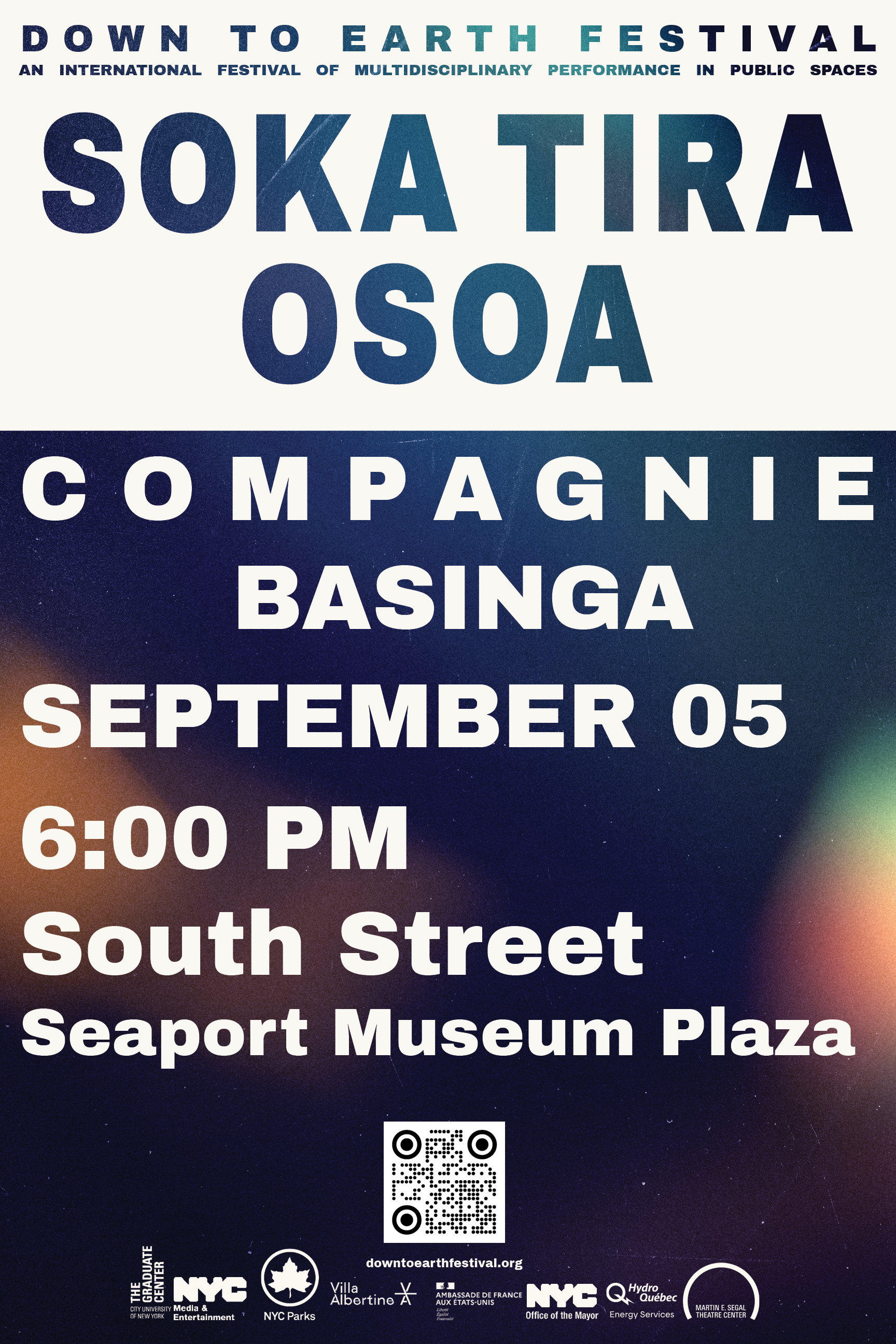
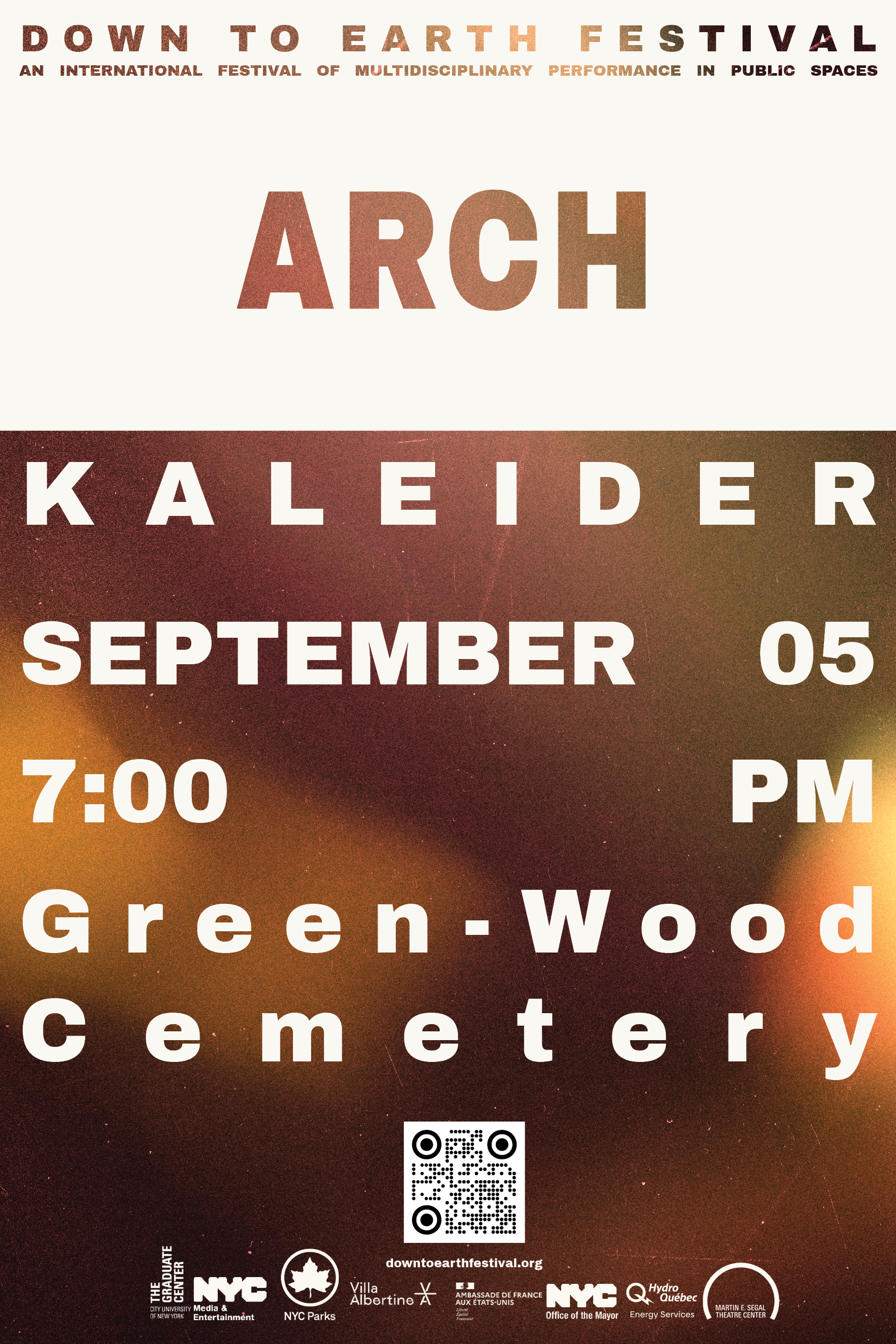
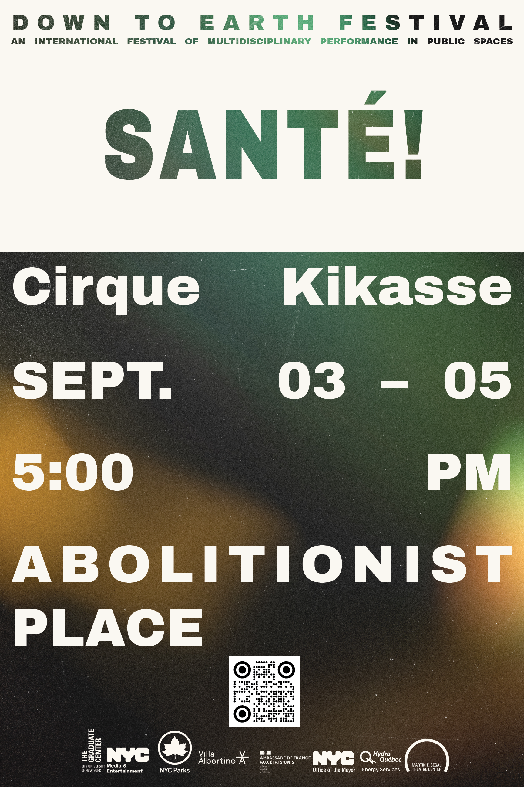
We developed a poster template that functions as more than a backdrop—it operates as a system. A subtle gradient background establishes a consistent visual language that carries across every festival touchpoint. Drawing from the cinematic texture of the festival’s digital banners, the imagery introduces a filmic abstraction that feels both timeless and contemporary. The result is an identity that is flexible, immediately recognizable, and built to move seamlessly between print and digital contexts.
Anchoring this foundation is a bold top tab—an assertive block with knocked-out lettering that clearly signals the festival brand. From there, large-scale typography cascades through the composition in a dynamic hierarchy, guiding the viewer from headline to detail with clarity and momentum. The layout resolves with a QR code and sponsor acknowledgments, integrating utility and partnership directly into the visual system.
All sponsor logos were unified into a single custom color drawn from the festival’s established palette. This decision reinforces continuity with past branding while allowing partners to integrate seamlessly into the overall composition. Together, these elements form a poster system that is both flexible and iconic—balancing clarity with impact, and creating a cohesive visual language that amplifies the festival’s presence across platforms.